In this Code Composer Studio graphing tool tutorial, graphing variables will be demonstrated in Texas Instruments IDE. The process is fairly straightforward and will be shown in a video as well as some screenshots so it can be easily replicated.
Introduction
For the demonstration a program running on the MSP430G Launchpad was used, with the MSP430G2553 fitted. The Launchpad was connected to a small experimental PID boc I have constructed, which I call the ‘Pocket PID’ (tutorial to follow on this), the box uses a LM35DZ temperature sensor as well as a few other components. The voltage from the LM35DZ is sampled and then two variables are generated; a variable called Result which is comprised of a raw data set of several over samples and a variable called FilteredResult, which is a digitally filtered version of the Result variable. Both variables can be viewed side by side which allows the effectiveness of the digital filter to be observed, the box also has a small heater and fan which allows the variables rate of change to be viewed over time in a graphical format. This provides a good example of how the code composer studio graphing tool can be used.
The graphing tool can also bee seen in action on another tutorial based on the C2000 Launchpad, where it is used to view the operation of an solar MPPT, graphing the power, voltage and PWM duty cycle. The third part of the article concerned with this can be found here and the YouTube video here.
Code Composer Studio Graphing Tool Tutorial – Video Demonstration
Code Composer Studio Graphing Tool Tutorial – Main Steps
The main steps to access the the graphing tool in code composer studio (CCS) are carried out in debug mode, so all the screenshot images below are taken from within that mode. As with all software there are often other ways to achieve the same results, this is just a method that works for me.
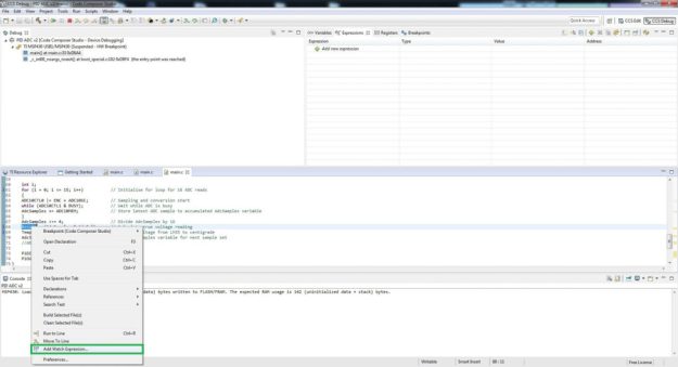
The first step is to decide which variables you want to graph and add these as Watch Expressions in CCS, this is achieved by highlighting the variable and then right clicking to bring up a properties menu, from this menu you want to choose the Add Watch Expression selection. This is shown in the below image.
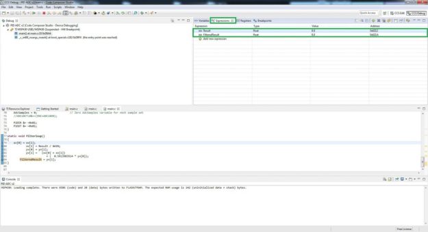
If this has been successful then the variable chosen should then appear in the Expressions window, which is shown in the next image.
You can add as many watch expressions as necessary, the video demonstration shows two variables being watched and graphed, but I have successfully watched and graphed four expressions. I am not sure if there is an upper limit, but i have noticed stability issues when many variables are being watched over a long period of time.
After adding the variables required to the watch expression window, the next step is to add breakpoint and then edit the breakpoint properties. Adding a breakpoint can be achieved either by double clicking on the line number, or highlighting a section of code on the line number and right clicking, then selecting the Breakpoint (Code Composer Studio) and Breakpoint option. The image below illustrates this action.
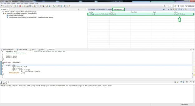
Once the breakpoint has been added it should be visible in the Breakpoint window, for the breakpoint to be enabled it needs to have a tick in the far left column. The image below shows the breakpoint window with the tick in the far left column, as well as an arrow highlighting the Action column.
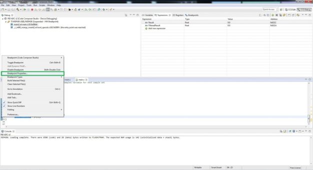
A breakpoint by default will halt the program at the chosen point, for the graphing tool to work all the windows simply need to be refreshed, this then allows the Expressions window and the graph to be updated. The next image illustrates how this is achieved by editing the breakpoint properties. I simply right click on the breakpoint symbol shown next to the line number it will activate, this then brings up a properties list and then select the Breakpoint Properties option. The image below shows this then step.
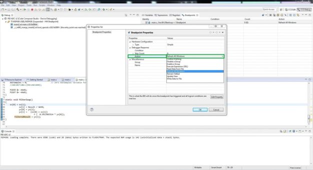
Once the Breakpoint Properties window is open there are a few options that are accessible, for this tutorial only one is of interest which is the Action property. As already mentioned the action the breakpoint will carry out by default is half the program, for the watched expressions to update, this action simply needs to be changed to Refresh All Windows. The next image illustrates how this is changed.
Now that the variables have been added and a breakpoint has been placed and set-up to perform the required action, the variables to be graphed can be chosen and set-up. To bring a graph up for a particular variable, right click on the variable in the Expressions window and then select the option Graph, as per the image below.
Once the graph option is selected the graph should be visible in CCS, I find it usually defaults to the bottom left of the window, as shown in the next image. The graph window can be manipulated to the required size as well as being picked and placed as required. Additional graphing windows can be added for other variables in the same way.
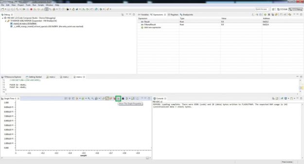
Now the graphing windows also has various options which allow you to tailor the view for your requirements, by hovering over the symbols small tooltips will appear which give a good impression of the button’s action. This tutorial will only cover two of the buttons which provide enough of an introduction for now. The first button is the Graph Properties button which is shown in the image below.
By clicking this button a new window will open which displays some useful quick access properties. I usually use the Grid Style option to add a Major Grid to the x and y axis, additionally the Display Data Size option allows you to determine how much data is viewable on the graph, before it is pushed off the edge of the screen. For long data captures increasing the Display Data Size can be useful, I have had issue with instability here though so its compromise on other settings such as Sampling Rate Hz as well as other settings for CCS when in debug mode. The Graph Properties window is shown in the next image.
The next button that will prove useful is the Graph Display Properties button, this is shown in the next image (also note the Major Grid now shown on the graph window).
The Graph Display Properties window again has quite a few options, allowing things like colour, number formats, axis names and scale to be changed. Some of these options are demonstrated in the video, the image below shows the Graph Display Properties window and the option for the Y axis Set Number Format option window open.
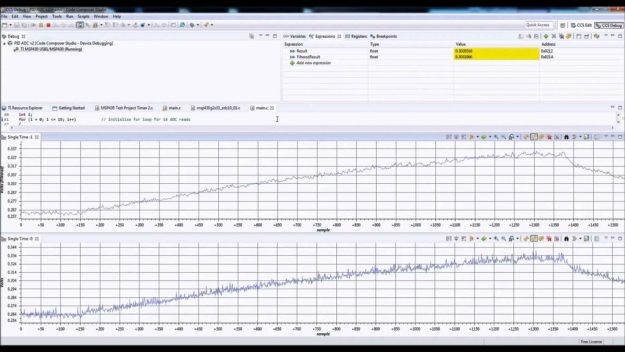
The final image shows a screen capture from the video, with both sets of data displayed side by side.







Hi, very nice video on the MSP430 and CCS for graphing. I am somewhat new to the MSP430 series, and I need to fairly quickly develop a monitoring system for a 44kW RF generator at work. Do you have the text file of your MSP430 program that you might be willing to share? Thank you. Bob Niels
Hi Bob,
There was an issue with most of the links being http: not https: I hav now corrected this so all downloads should now be working. All the MSP430 code examples should now be downloadable again, sorry for not replying sooner, Ant
how to export that data from real time graphing of CCSv4
Hi,
I am not sure on CCSv4 and it may not even be possible, the TI forums would be the best route to get a qualified answer on this, sorry for not responding sooner.
Can I use graph tool to display a Sinusoidal waveform which is measured from sensor? I used the graph to display a sinusoidal wave but I failed.
Hi,
CCS can only update the graph at a rate of 100mS, so depends on the frequency of what you are sampling.
Cheers,
Ant
Thanks, it’s very useful.
Cheers and glad it proved useful.
Can we plot 2,3…expresstions in one Graph?
ex: Setfrenquency and Current Frequency?
Thank you.
Hi Kiet, I am pretty sure this is not possible with the current graphing tool in CCS. You can have multiple graphs side by side which I have used on a MPPT project and tutorial for the C2000. An alternative is to export the data from multiple variables, then generate a custom graph in something like Excel.
Cheers,
Ant